Tuesday, January 15, 2013

My Process

First let me say that there are some much better (and knowledgable) illustrators out there who have done post similar to this.  You should check them out, too.  A good place to start is the Muddy Colors blog.  Justin Gerard takes you through his entire process for a painting starting here.  Greg Manchess has a great series that he's been doing called 10 Things . . . This article on generating paintings is very useful, as is this one on planning pictures.  And Dan Dos Santos has a great article on sketching thumbnails here.

This is mostly a record for me - if someone out there is interested or finds this helpful, so much the better.  I find it beneficial to be held to some level of accountability with my art and as I have been struggling a little with some of my art and rushing (a big stumbling block for me) I thought it would be good to set my process down for all the eternal internet to see.

So first I start out with thumbnails.  Everyone starts out with thumbnails.  At least, I hope you do.  You should.  and if you don't and still come up with great art, do me a favor and don't tell me.  Please.  I don't need any more bad habits.

In all seriousness though.  Me, myself and I need to do thumbnails.  It helps to get all the ideas down on paper.  My professors at college encouraged us to do at least 50 thumbnails.  I really should do 50.  My goal is always to draw 50.  But reality usually looks more like 20.  Or 15.


As you can see, they are very loose.  Actually, no one really sees them at this point.  They're basically just ideas jotted down - I'm the only one who can really interpret them.

Next step is to pick the three or five best - in college that meant picking the ten strongest thumbnails, working them up a bit so more people could tell what was going on, and whatever three or five your prof thought were the strongest were the ones you went onto the next step with.  Through that you were supposed to learn which compositions worked and which ones didn't.  After college that means you kinda skip this step, pick the handful you like and hope for the best.


Then comes the fun part - the part where I really start to get excited about a piece.  Doodles become real ideas, you can start to see and feel the potential of a piece.  These are done without reference - usually still in my sketchbook but sometimes on the computer - I've been practicing.  These are ALWAYS little 2" or 3" VALUE sketches.  Value is important for me especially here at this stage because it helps create and drive the composition.  I'm always thinking in terms of value with pieces - where and how light will interact with shadow.

This is also where I decide how big the piece is going to be.  If I have a specific size I have to work with then the thumbnails at this point need to be in proportion to the final size or I run into HUGE problems later with composition.  If the composition works small here, it will work big later on, but only if it's the same proportions.


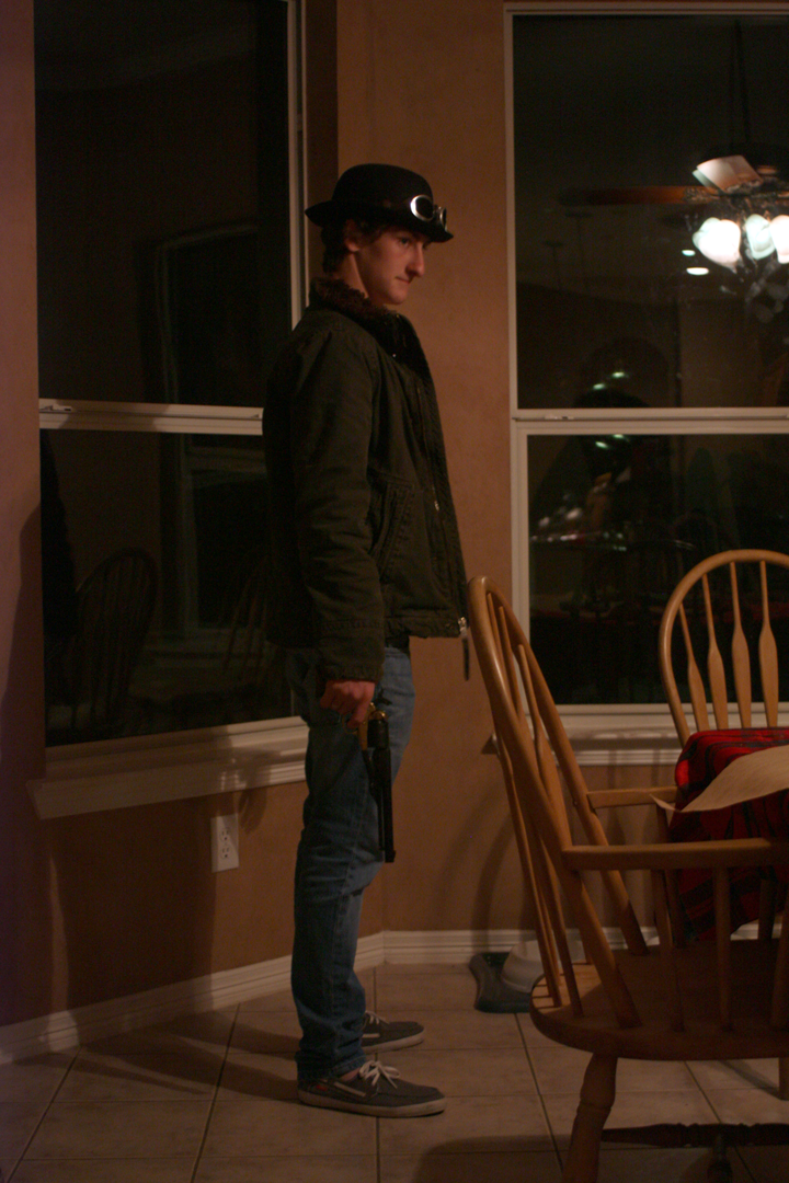

Next is the reference stage.  This is also a fun stage; I bring in people to photograph - usually I see the person I'm going to use as a model in my head and then bribe them with empty promises of fame and fortune.  Or prints of the final painting.  They never seem to believe me about the fame and fortune bit . . .

Anyway, I used to hate this stage; I hated asking people to model for me.  And then there was the whole photographing piece and I always felt so awkward.  But then I came home and I knew (kinda) all the people around and most of them either have changed my diapers, or I've changed theirs.  Or they're married to my siblings and I might potentially change their kids' diapers.  So with the common bond of diaper changing under my belt, I found my whole perspective towards photo reference doing a 180, and now the collaborative piece just adds so much life to the piece.  I find myself drawing and smiling as I work, remembering the person and or the interactions that happened while shooting the reference.  And it also helps that there's at least one person waiting with some level of bated breath for me to finish.

There's also some level of silliness that happens - especially if one or more of my brothers is involved.


The value sketches come into play at the reference hunting/gathering stage.  I try and set up the model with lighting as close to the sketch as I can.  Sometimes I find out that I really didn't want that lighting set-up that I thought I did and have to change my reference and sketch accordingly.  The Dragon Tamer piece is a good example of that.  I didn't really know what I wanted as far as lighting for it, and I didn't put as much effort into that stage of it as I usually do.  Needless to say, it's come back to bite me and I'm spending almost double the amount of time in the planning stage than normal.


Then there's the maquette stage - this is an "as needed" stage that I only recently added to my process . . . Not a huge fan, but it is going to be a huge help. 

After I've pieced together my reference and background comes the drawing stage.  I'm usually most comfortable here.  No color, just value and composition.  Sometimes I'll draw a specific aspect of the piece separate - the character, or their hands and piece the whole thing together in Photoshop.  It helps to focus attention on the character and really define details.  Learned that one from Justin Gerard, who apparently learned it from animators.  Which is brilliant.  And it's a huge help.

So once I have the background and the characters sketched out exactly the way I want them with the value stuff all settled so it looks pretty close to the two toned Little Red Riding Hood Steampunk piece up there, it's time for the color comp.


I have no strategy here. Really, I don't.  Sometimes I get some info from the reference, but otherwise I just throw color on a sketch until it's unusable or it gives me an idea and I move to a new one until I know exactly what I want.  Or at least I know mostly what I want.


Then the drawing goes on the board or paper.  I use either a light table or tracing paper to sketch in the rough shapes, but after that I do everything by hand.  And this is a tight drawing.  All the shadows, all the lines, no information is left out.  Eric Fortune and Rebecca Guay taught me this and it's been such a . . . I don't even know how to describe it.  Laying in color is easier because some of the value is already established.  I don't loose as much of my drawing - which is again what I love most about the piece at this point.


Then comes the first layers of color.  Nothing real fancy here, just establishing some of the overall color of the piece.  The first two or three layers are watered-down acrylic that I use like watercolor (but not with my watercolor brushes).  The benefit of this is that 1. I seal some of my drawing and 2. that those first initial colors don't get lifted out by the subsequent layers of watercolor.  I can get real wild with the first layer of watercolor because I know that I won't be lifting anything up that I put down first.  And by using watercolor for the rest of the piece, I get all those awesome watercolor-ish things that happend when you let watercolor do what it does.


By this point, I've usually lost myself in the painting and it's time to draw again.  So out come the colored pencils.


After that I go back and forth between the watercolors and the pencils, pushing or pulling as needed.  My biggest help at this point is the piece of scrap board or paper that I keep next to the piece to test all my colors or the strength and amount of my paint before I put them down on the actual painting.  

And then there's the part where you take the tape off and scan or photograph the work, put it into the computer and start editing it there for printing.  Ugh.  I never understood until recently how frustrating it is to see your work on the computer screen and think that it's just not as good as the real thing.  

Monday, January 14, 2013

A Reality Check

So, if you haven't figured it out yet, I'll just say it straight out: I'm a little OCD.  And a little bit of a perfectionist.  And a wee bit of an over-thinker.

In the interest of combining all of these personality . . . let's say "quirks" - "Quirks" is a nicer word - I have calculated (with much effort and a great deal of mistakes, I'm sure) out how I've spent my time over the past 3 or 4 months.  And also in the interest of full disclosure, I have decided to share it with you.

Average Time Spent

32%  -  Work+Transportation
25%  -  Sleep
10%  -  Art
3%  -  Church
2%  -  Class

And, finally:

28%  -  Unknown

Holy crows.  I mean, some of that time is little things like eating and showering, but still - is that normal??  I have no idea how I spend almost 30% of my time per month!  That's like 8 days a month that I'm piddling around doing who knows what! Well, actually, that's probably time I spent watching Alias . . . Dear Lord.

My goal for the end of July is to be able to bump up that 10% of time spent on art to 20%.  At least then that means I'm only spending 4 days piddling . . .

Thursday, January 10, 2013

Some Truth for Today

I've been collecting some art quotes on Tumblr and thought I would start a new post series here to share them with you.
“Treat a work of art like a prince: let it speak to you first.” 

— Arthur Schopenhauer

Tuesday, January 8, 2013

Owl + Goldfish = Dragon?


Here's what I am (still) working on.  Dragons, dragons and more dragons.  I was looking at snakes, eels, alligators and lizards for reference, but I have since moved on to owls, seahorses, horses and turtles, and I'm not quite sure what else.  Maybe goldfish.  But it's good prep for my next super secret project (already in the works, I've started the 'required reading' and stuff).  You wont see much of the process for a while; it's a surprise gift for someone and I'm not sure how often they check up on me here.  But Dragon Tamer gets done first, and as you can see, the prep-work has been much more substantial than I anticipated (as well as holiday festivities throwing off my groove).  I've still got a maquette in progress.  And the rest of the plot outline to write.  And the painting to finish.  By the eighteenth. Oh, dear . . . 

Friday, January 4, 2013

2013 Illustrations


I just finished my project list for 2013, I think.  I have about 8 pieces outlined.  Subject to change of course.  Those of you who have been anxiously awaiting more Chronicles of Prydain will not be disappointed, I hope.  I've left a few slots for pieces from The Hobbit, too.

I'm going to push my portfolio to more middle-grade/young adult.  Also working on some more drawing centered pieces as well as black and white line-work for spot illustration samples.  We'll see how this all goes.

Prints are up in the store, if you're interested.  They're nice giclee prints on high quality cotton rag paper.

Happy New Year, everyone!

Wednesday, January 2, 2013

An Artist You Should Know About


William Russell Flint is an artist who worked in both watercolor and oil.  I LOVE his stuff.  There's no specific site I've found that has a good variety of his work, but you can start here. I've done a few posts on him before, as well.

Happy New Year!

"Gabriel was not very good at magic.  His parents told him and their friends that he was only "struggling a little".  His older brothers were more blunt (they usually were) and said that there hadn't been a Prendergast so uniformly bad at magic for ten generations."
Next piece in the works.  This is just a sketch - no his arms are not deformed, I just drew them poorly.

Stay tuned for a story summary!